Case Study
COLOUR
Designing an AI-Powered Identity Ecosystem for Niche Culture Communities. Building digital families that transform shared interests into identity, belonging, and meaningful relationships.
Designing an AI-Powered Identity Ecosystem for Niche Culture Communities. Building digital families that transform shared interests into identity, belonging, and meaningful relationships.
01 — Overview
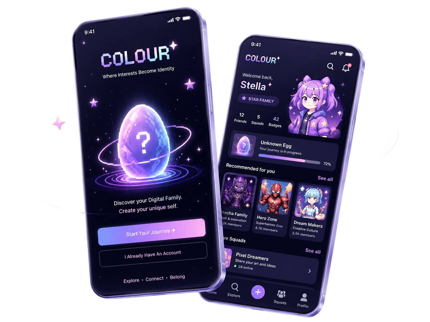
COLOUR is an identity-driven social platform that helps people discover niche communities through digital family identities, AI-generated personas, and shared cultural interests.
Unlike traditional interest-tagging systems, COLOUR organises users around 12 Digital Families — each a distinct cultural world. Users are matched through a unique AI-powered onboarding ritual called the Unknown Egg.
I led product strategy, UX design, and AI-assisted workflow across the full 6-week sprint.
Sprint Timeline
Research & Competitive Analysis
30 surveys, 5 user interviews, competitive landscape mapping across Instagram, TikTok, Discord, Reddit
Product Strategy & MVP Definition
COLOUR Framework, Digital Family concept, Taste Graph architecture, MVP scope with founders
UX Design & AI-Assisted Exploration
IA, wireframes, hi-fi screens, AI persona generation using GPT, Stitch, and 即梦
Prototype Testing & Iteration
24 prototype tests, usability synthesis, design iteration based on findings
Developer Handoff & Investor Demo
Figma component documentation, handoff specs, investor demo prep for pre-seed fundraising
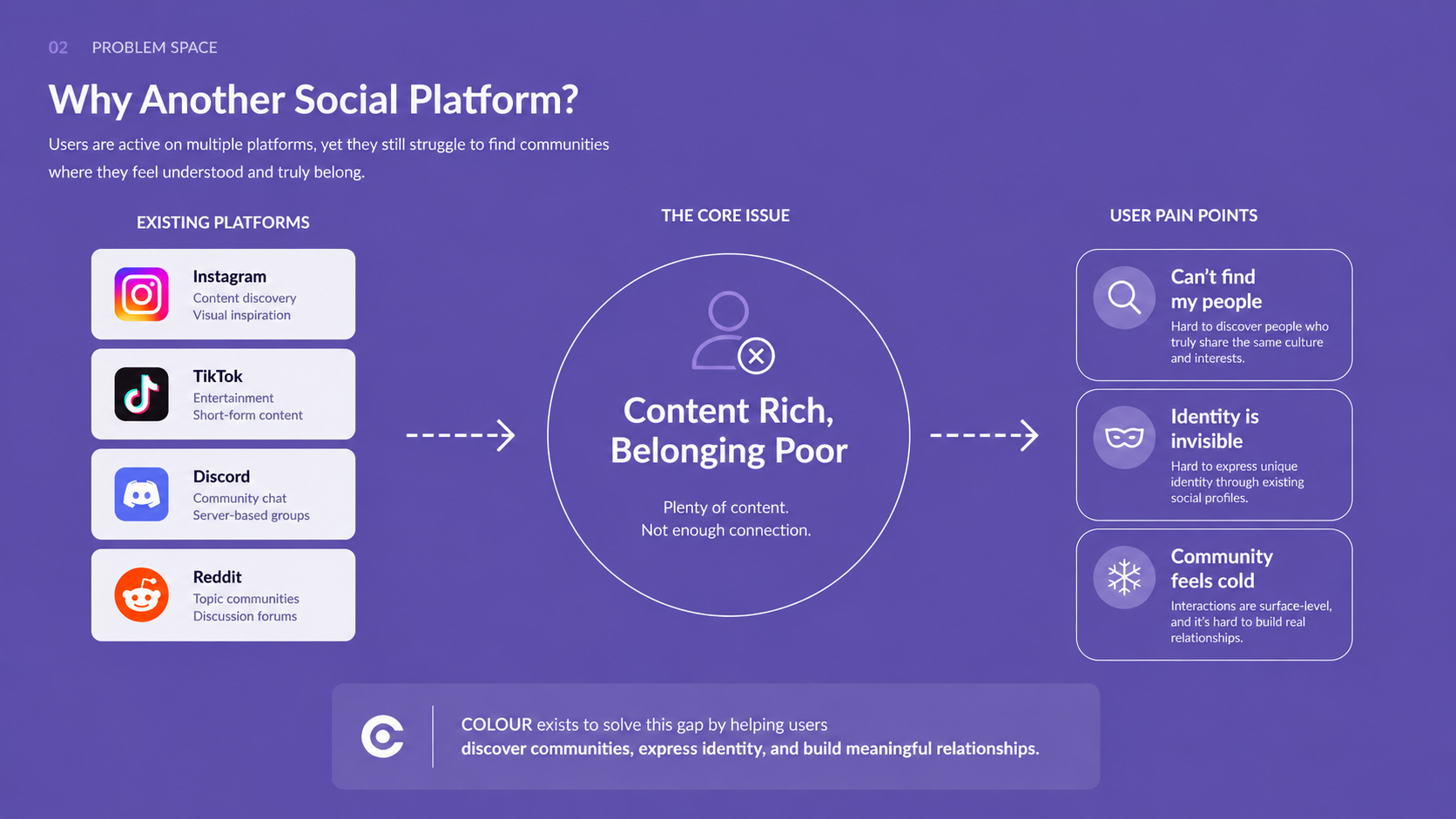
02 — Opportunity & Research
Platforms like Instagram, TikTok, Discord, and Reddit are content-rich but belonging-poor. Users can consume endless content but struggle to find people who share the same niche aesthetic, cultural identity, or creative sensibility.
Existing social platforms optimise for engagement metrics, not genuine connection. Interest tags are shallow. Algorithmic feeds prioritise viral content over cultural resonance.
This creates a systemic gap: niche culture communities are underserved by mainstream platforms, leading to fragmented identity expression and low-quality belonging.
The opportunity is clear — build a platform where identity is the entry point, not the afterthought.
User Research
We recruited participants across four target user groups: Creative Students, International Students, Niche Culture Communities, and Independent Creators.
Research focused on how people navigate identity expression, community discovery, and belonging in digital spaces.
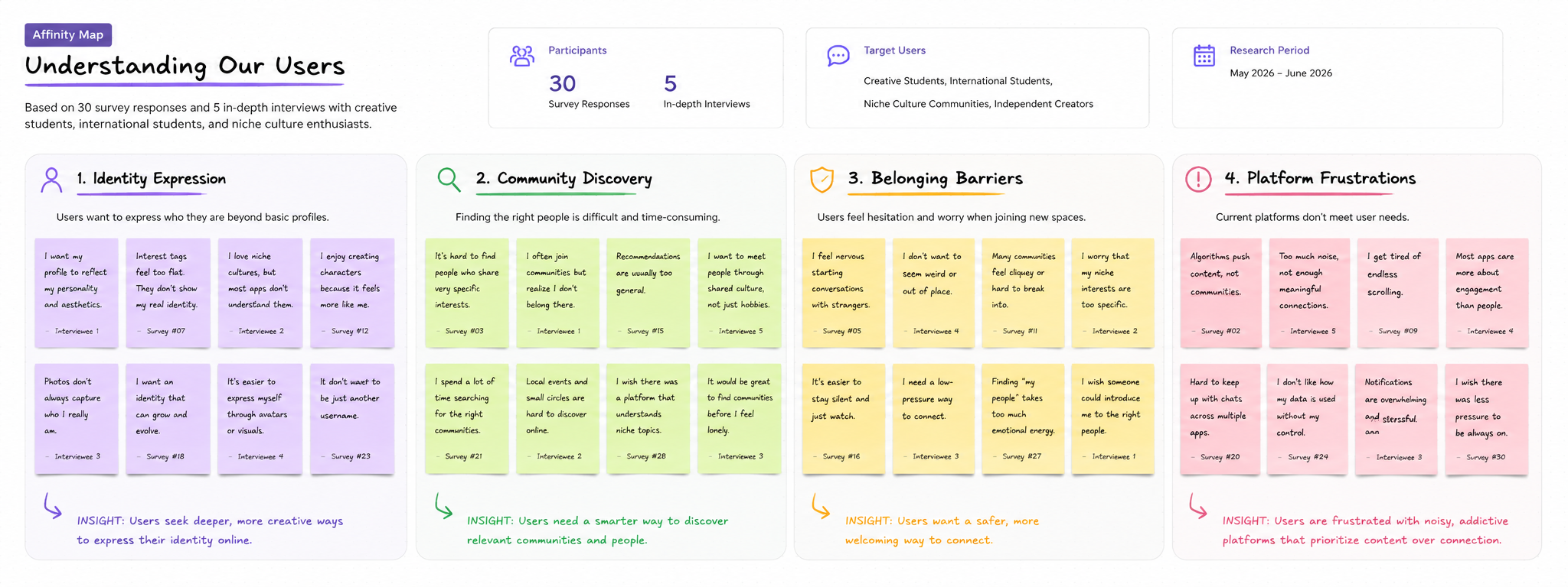
Affinity Map — synthesised from 30 surveys and 5 user interviews
Insight 01
People want to find their people.
Users don't just want content — they want to feel seen by others who share the same cultural wavelength.
Insight 02
Identity matters more than content.
The desire to express who you are — aesthetically, culturally, creatively — drives community attachment more than content quality.
Insight 03
Users want low-pressure social interactions.
The anxiety of cold social spaces is a major barrier. Users need gentler, more contextual entry points into community.
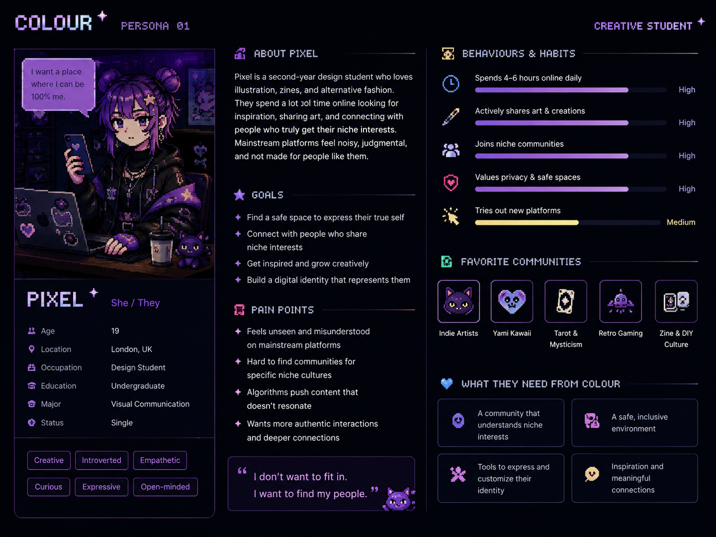
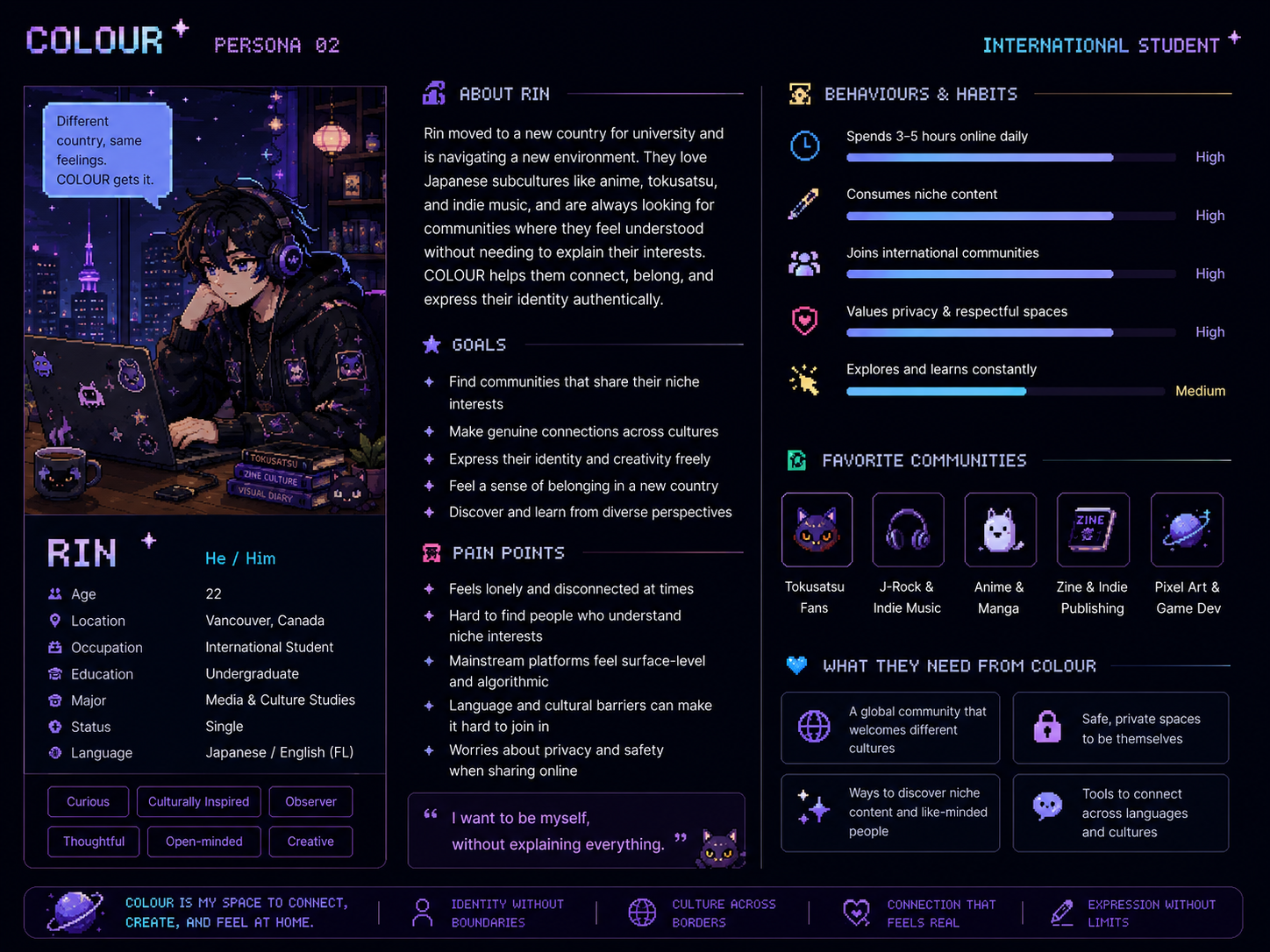
User Personas
Based on research synthesis, we identified two primary user archetypes that represent the core needs of COLOUR's target audience — niche culture enthusiasts who are underserved by mainstream social platforms.
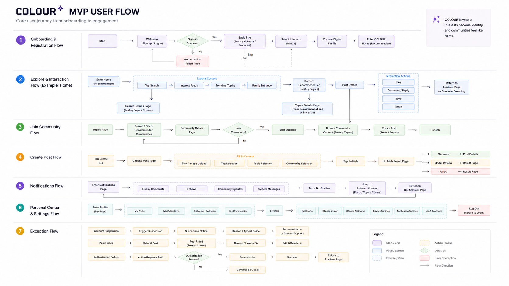
User Flow
We mapped seven core user flows to ensure every interaction path was intentional — from new user onboarding and content discovery, to community joining, post creation, and account management. Edge cases and error states were defined at each decision point.
User Journey Map
The journey map traces the emotional arc of a new user across six stages — from discovering COLOUR to becoming an active community member. It surfaces pain points at each touchpoint and identifies key design opportunities that directly shaped our product decisions.
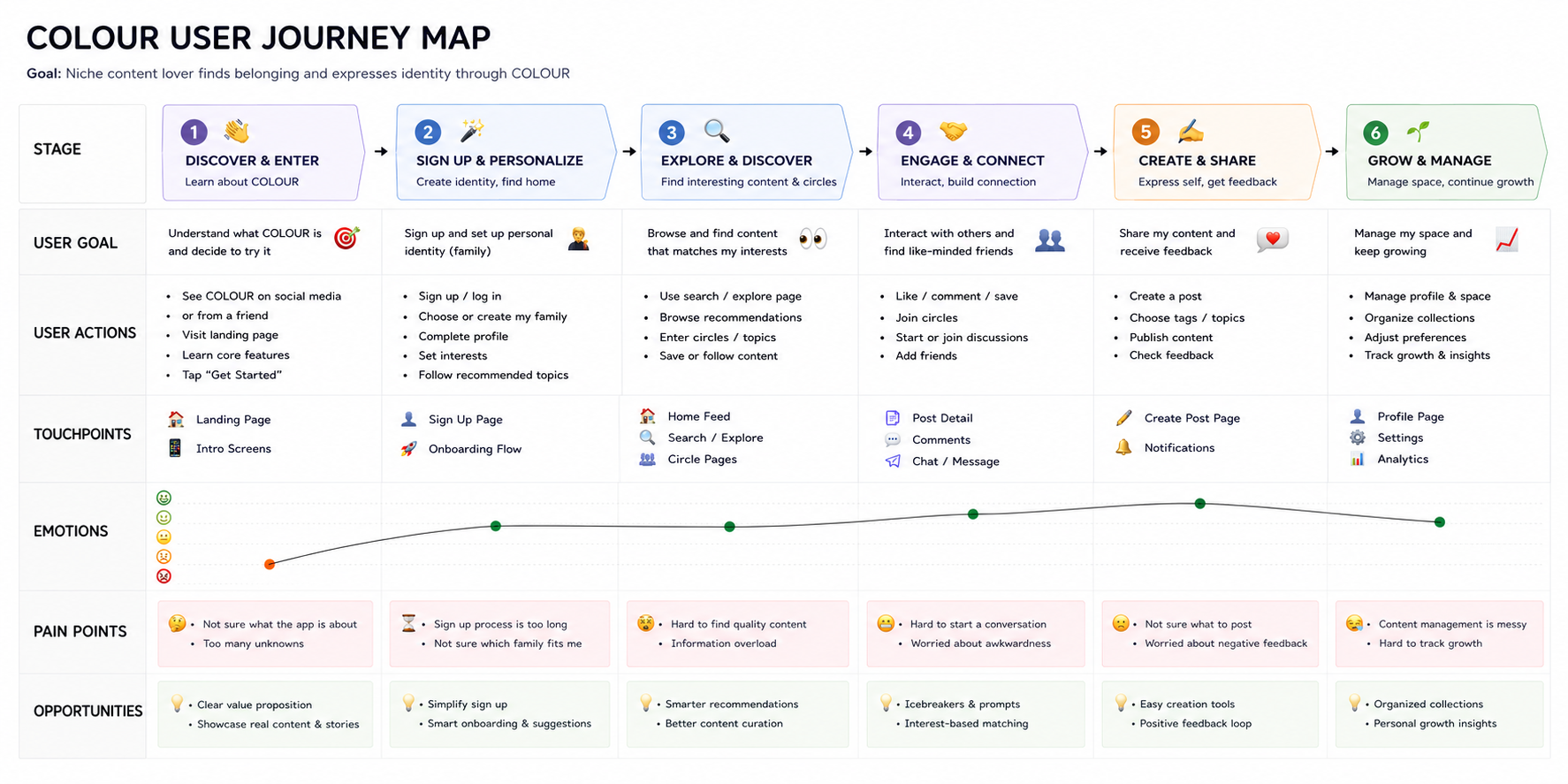
User Journey Map — 6 stages from discovery to long-term engagement
03 — Product Strategy
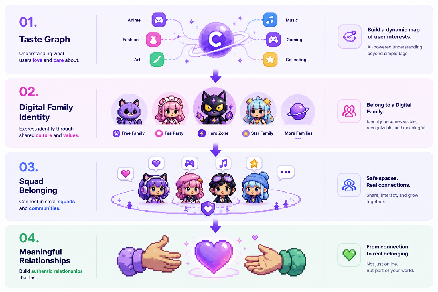
Instead of interest tags, we designed a Taste Graph — a dynamic identity layer that maps cultural preferences, aesthetic sensibilities, and community behaviour into a coherent digital identity.
This flows through the product in three layers: Digital Family Identity → Squad Belonging → Meaningful Relationships.
Information Architecture
Every touchpoint — from onboarding to daily use — reinforces the user's sense of belonging to their Family and Squad.
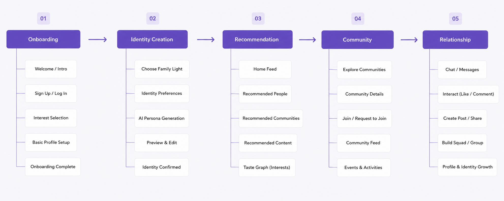
Onboarding → Identity Creation → Recommendation → Community → Relationship
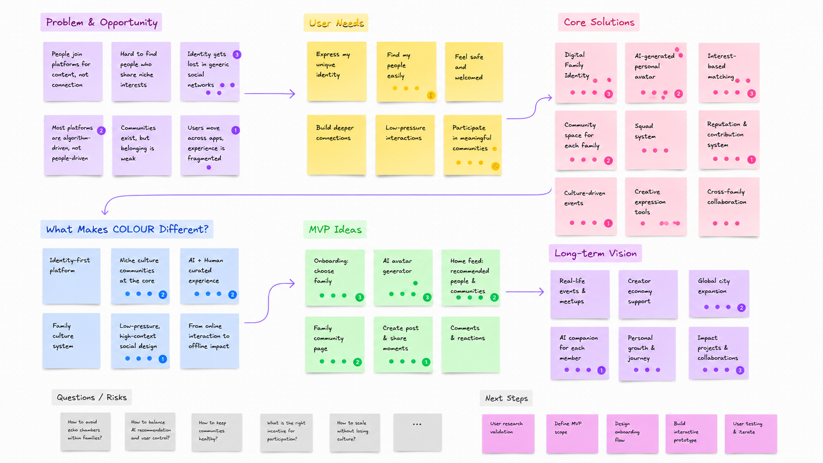
Brainstorming
Before committing to any design direction, the team ran structured brainstorming sessions in FigJam — mapping opportunity spaces, challenging assumptions, and aligning on product priorities with founders and the cross-functional team.
04 — Digital Identity System
The core of COLOUR's differentiation is the Digital Family system — 12 distinct cultural worlds, each with its own visual language, identity artefacts, and community culture. Users belong to a Family, not just a category.
01
Tea Party
Elegance, ritual, and collecting — inspired by Lolita culture
Soft Pink02
Free Family
Freedom, self-expression, and creation — inspired by Furry culture
Cyan Blue03
Heart Overload
Emotion, intensity, and vulnerability — inspired by Jirai Kei / Yami Kawaii
Pink + Black04
Fluffy Family
Comfort, healing, and warmth — inspired by Plush & Comfort culture
Cream Beige05
Star Family
Decoration, playfulness, and creativity — inspired by Decora culture
Rainbow Pastels06
Arcane Family
Mystery, wisdom, and intuition — inspired by Tarot & Mysticism
Deep Violet07
Cheer Family
Support, passion, and energy — inspired by Idol Support culture
Bright Pink08
HERO·ZONE
Courage, justice, and transformation — inspired by Tokusatsu culture
Red + Silver09
Heart Choice
Romance, connection, and storytelling — inspired by Otome culture
Rose Gold10
Dimension Switch
Expression, performance, and dual identity — inspired by VTuber culture
Neon Purple11
Dream Makers
Imagination, creation, and inspiration — inspired by Creative communities
Sky Blue12
Cabinet Universe
Collecting, curation, and nostalgia — inspired by Collectibles & Hobby culture
Indigo Purple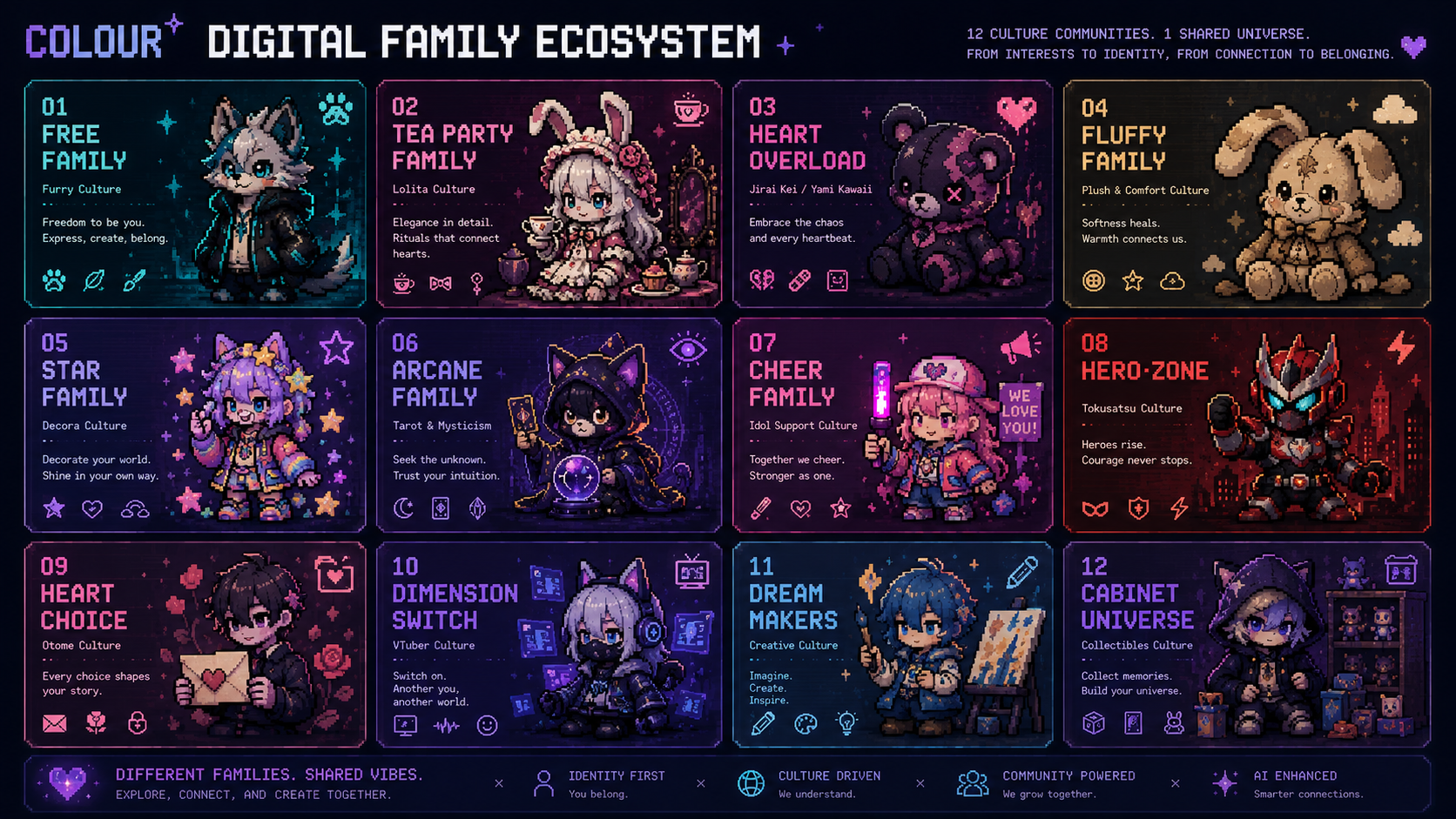
AI Identity Creation
Onboarding is designed as an identity ritual, not a registration flow. Users begin as an Unknown Egg — undefined, full of potential. Through a series of choices, the egg absorbs Family Light and transforms. AI then generates a unique Digital Persona based on the user's selections.
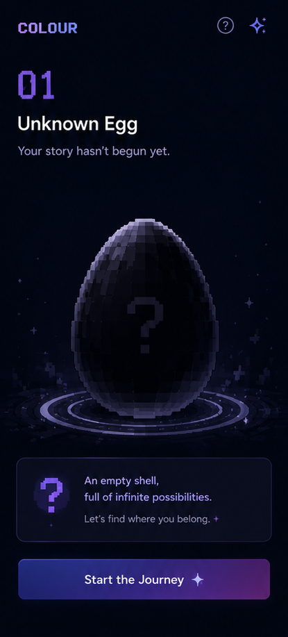
Unknown Egg
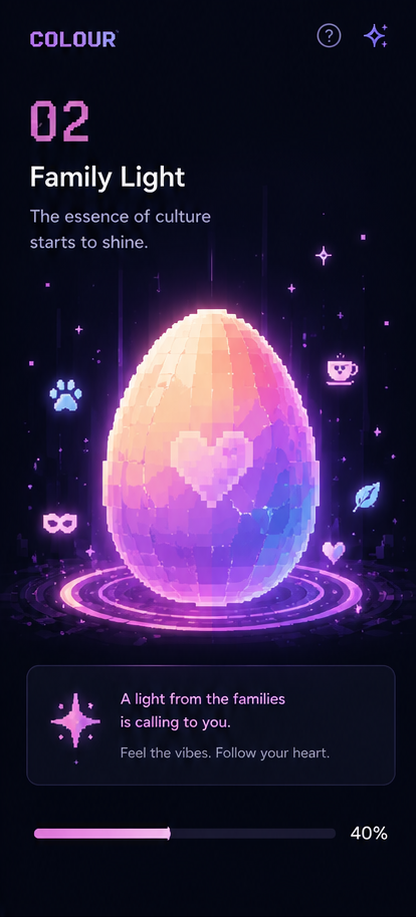
Family Light
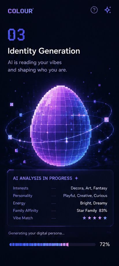
Generation
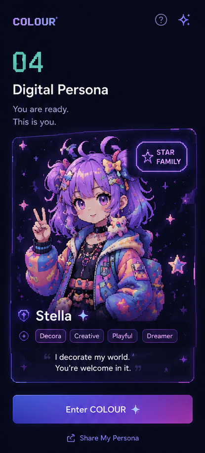
Digital Persona
05 — AI Workflow
AI wasn't a buzzword — it was a core part of the design process. I used AI tools at every stage to accelerate ideation, generate concepts, and explore visual directions that would have taken weeks manually.


06 — MVP Design
Onboarding Experience
The onboarding flow feels like an identity ritual — reducing the anxiety of joining a new social space by making the first experience about discovery and self-expression.


Home & Community
The home feed is powered by the Taste Graph — surfacing content by cultural alignment, not just engagement metrics.


Create, Notify & Profile
Content creation is a relationship trigger — posts, events, and interactions are structured to facilitate real connections within Families and Squads.


07 — Validation & Impact
We tested the prototype with 24 participants across target user groups. Results validated the core design decisions — particularly the identity-first onboarding and Family discovery mechanism.
Outcomes
MVP Completed — Full design system, all core flows, developer handoff delivered within 6-week sprint.
Investor Demo Ready — Interactive prototype prepared for pre-seed fundraising presentations.
Pre-Seed Support — Design artefacts directly contributed to investor pitch materials.
Reflection
This project pushed me to think beyond UI — to design a cultural product where identity, belonging, and AI capability are inseparable.
The biggest learning: when you give users a meaningful identity framework first, the rest of the experience becomes intuitive. People don't need to be taught how to belong — they need the right context.
Future: AI Persona Evolution, Family Growth System, Creator Economy integration.
Engineering Collaboration
Collaboration with engineering wasn't an afterthought — it was embedded throughout the sprint. To accelerate development velocity, I recommended adopting Ant Design as the base component library, with custom theming and component overrides to align with COLOUR's visual identity — reducing front-end build time while maintaining design consistency. Weekly syncs with frontend and backend teams ensured every design decision was technically grounded and implementation-ready.
Ran weekly design reviews with founders, frontend engineers, and backend engineers to align on scope, surface technical constraints early, and iterate fast.
Delivered complete Figma component documentation with spacing, states, and interaction specs — reducing back-and-forth with engineering by eliminating ambiguity.
Conducted 3 dedicated feasibility review sessions with frontend engineers before finalising the AI Identity Creation flow and Family Ecosystem screens.
Worked across a team of 3 frontend and 3 backend engineers — bridging design intent and technical execution across web and mobile platforms.